NZTE
Pallet Design System
Democratising NZTE’s new, cross platform design system
Overview
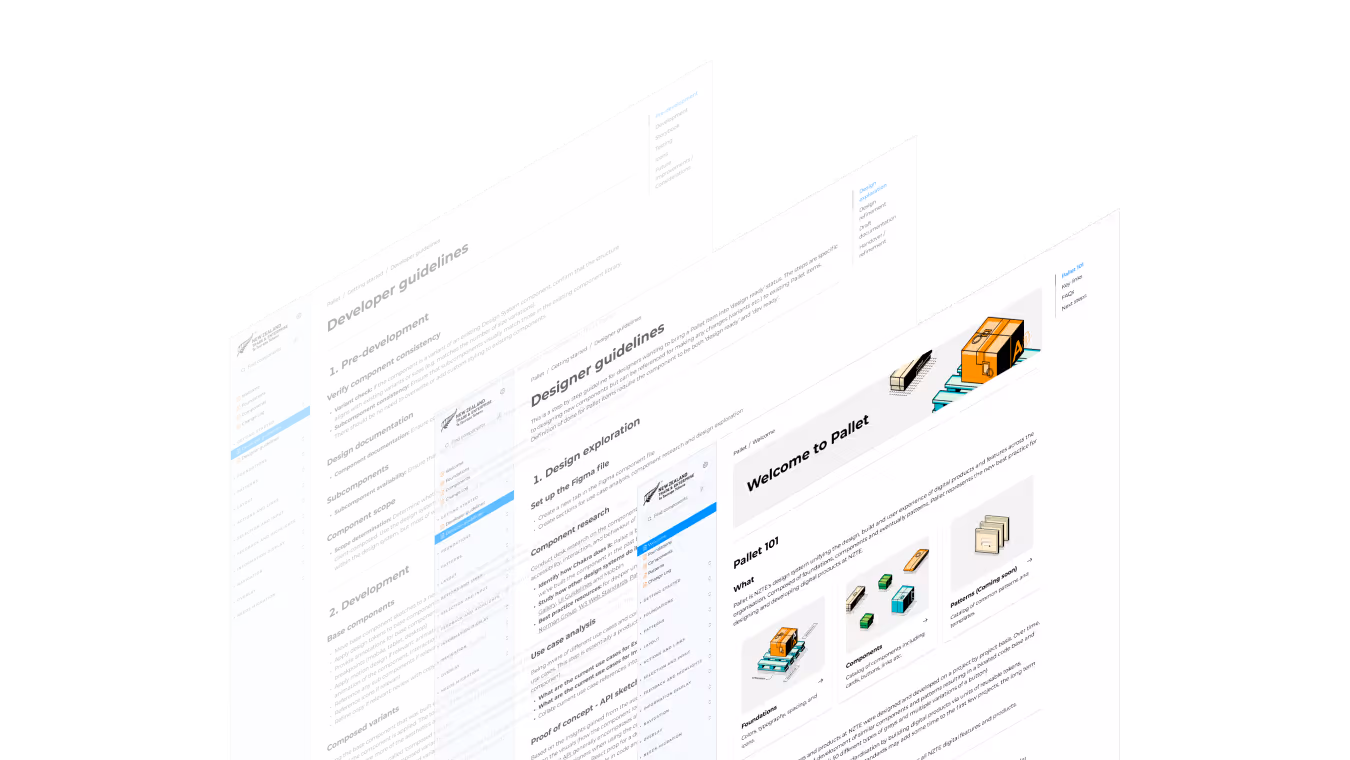
Pallet is NZTE’s new, cross platform design system to service all of NZTE’s digital products made up of tokens, components, patterns and equivalent code base and Storybook documentation.
As an early adopter and contributor to the system, I've had the opportunity to design and document a number of core components as well as helping to establish collaboration guidelines and best practices to ensure successful adoption into our day-to-day workflow.
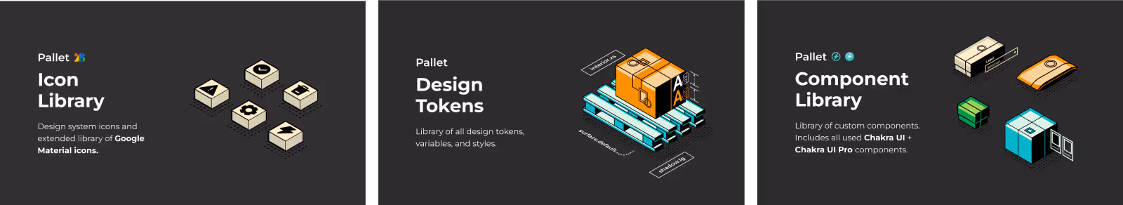
Summary of system layers
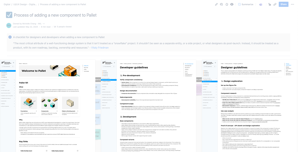
Outputs
- Scoping, design and draft Storybook documentation for components of various complexities including text area, multi-select and the progress stepper. Facilitating developer handover into the code base and Storybook url for each component.
- Took the initiative to systematise the process of developing new components in order to democratise the work beyond the original project team.
- Ran internal research (9x 30min 1:1 evaluative user interviews) with new adopters of Pallet to uncover common pain points of contributing to the design system. Synthesised, analysed and packaged the insights that would later inform future ways of working.
- Every component is researched and designed to meet at least WCAG 2.0 Level AA standards and must pass A11y tests to meet requirements as a government agency.
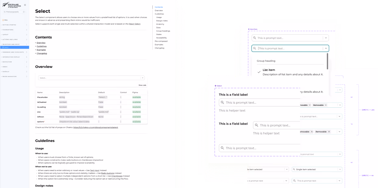
Sample of a component designed in Figma and documented in Storybook
Impact

Consistency
- Built on the Chakra UI component system, Pallet provides flexibility, consistency and accessibility compliance across all NZTE digital products.
- An opportunity to tidy up two bloated code bases into a single, shared code base.
Efficiency
- Reduced development time and costs by utilising reusable components and documentation for quicker iteration and delivery of new features and services. Success metrics are in the process of being measured including ‘average time on user stories’ in DevOps for developers, designers and Epics overall.
Usage guidelines
Reflections
Working on the design system marked a turning point in my technical depth as a designer, shifting my focus from rapid feature delivery toward long-term, reusable foundations shaped through close collaboration with engineers.
From this, two lasting lessons emerged around system-level thinking and shared ownership of quality:

Design systems shift focus from features to foundations
Prioritising reusable patterns and long-term scalability challenged fast feature delivery and required broader, system-level thinking.
Cross-functional collaboration is core to system quality
Iterating with developers across squads from discovery to documentation strengthened shared understanding and delivery confidence.